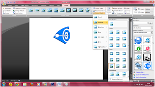
I thought that the logo was too flat so i decided to make it look a little bit thicker.

The steps are:
- I clicked on Format on the top of the tab.
- Then i clicked on picture effects.
- After that i then clicked on shadows and choose the type of shadow i wanted.
I was unhappy with the bright blue colour so i decided to change it to a a different colour and the steps are followed.
- I clicked on recolour
- Then i clicked on the dark brown colour.
I wasn't happy with the the brown colour so i decided to change it.
I Changed it into a dark purple colour and it was slightly better but the purple colour didn't suit the genre i was trying to portray so i changed it to a dark blue colour which fitted the genre better.
After the picture was done, i wanted to write the name of the logo next to the picture and the steps follows:
- I clicked on insert
- I clicked on wordarts
- I chose the format that most suited the logo
I realises that it would look weird if the text had a different colour from the logo, so i decided to change this and the steps follows:
- I clicked on Fotmat
- I clicked on shape filled
- Then i clicked on the colour i wanted


No comments:
Post a Comment