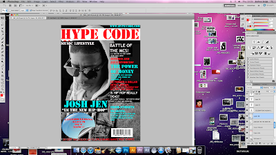
The first thing we did was inserted this image onto Photoshop.
Then we inserted a long white rectangle across the top of the image where we then wrote the name of the Masthead.
The steps follows:
- By the left hand side click on the rectangular marquee tool
- Highlight the area you want to paint white
- Click on the paint brush and click on the white colour and paint inside the white rectangle.
- By the left hand side click on the text tool and click on the red colour then type on the white rectangle.
The next thing we did was then added the tagline we did this exactly the same way as we did the masthead but instead we coloured it with a black colour and wrote on top of it with a red colour and made the font of the tagline a lot smaller than that of the masthead.
The next thing was to add the Name of the artist on to the image, this was done exactly the same way we added the Masthead and the cover line.
Then we added a tag line and again the same way the previous ones were done. We chose 'I'm the new hip-hop' to represent the way hip-hop artists think highly of themselves because hip-hop genre is highly related to class.
Below the tagline, we added 'Jay-z and Beyonce divorced'? This is because magazines usually have interesting topics and gossips to draw the attention of variety of audiences, to buy the magazine. We realized that we spelt divorced wrong but we kept it the same for a while because we were planning of deleting the headline and putting it in another position on the magazine front cover.
We decided to add other headlines such as 'The power of money' and 'Battle of the Mcs'.
This is because these are interesting things that go on in the hip-hop community, and by putting these on magazines will help to attract hip-hop audiences into buying this magazine.
Another headline that we have is 'J-cole, he turned a dollar into a dream'. We decided to use this headline because one of J-cole's song is 'A dollar and a dream', so we are trying to connect to the audience more by turning the topics that they already know a little about into big headlines.
'Is Hip-hop really dead?'. By using rhetorical question, we are forcing the find answers for themselves by purchasing this magazine.
We added another headline 'From streets to suits' and then we went on to talk 50 cent and Jay-z working together as business partners. This will definitely attract the audience into buying this magazine because 50 cent and jay-z are big rivals and the audience will be interested to find out why they are working together.
Our main task was to make a magazine front cover that advertised our digipak and our music, and in order to make it clear that this magazine is advertising our album we decided to add a sticker, which is advertising our album 'Celebration' on to the magazine cover.
The steps follows:
- Save a sticker from Google images onto your computer
- Open it up on Photoshop
- By the left hand side, click on the quick selection tool and select the background of the sticker and delete it.
- Select the sticker and on the tab above click on edit and copy the picture.
- Then open up the magazine front cover and paste it on top of it.
- Click on the text icon by the left hand side and add the text on top of the sticker.
We knew a magazine cover is incomplete without a barcode so we decided to add this to our music video to make it look professional. The barcode was added to the magazine the same way the sticker was.

We realized that the text on the sticker looked
too straight, and it just looked like it was pasted
non the sticker so we decide to make some changes to it.
Steps follows:
- I highlighted the text
- On the tab above i clicked on text wrap
- I clicked on style and then i clicked on inflate.
A feind of mine suggested that it doesn't the sticker that we used looks quite different from the ones usually used on hip-hop magazines, so we took on board the advice and we removed it.
However, there was a little problem because the main purpose of having the magazine is to inform our audience about the digi-pak so we had to find another way to do this. So we decided to add two different layers which had the name of the digi-pak and the other layer was telling the audience that it is out now in stores.

My teachers later suggested 'Out now in stores' showed that our magazine was trying to persuade people to buy our magazine. We had to changed this because it is not the magazine's duty to advertise the digi-pak, its just met to inform our audience about it.
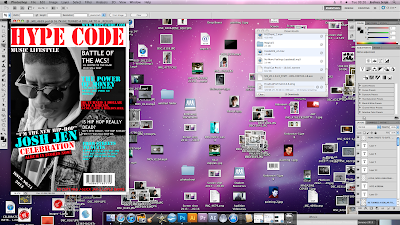
Some of the different coloured cover lines didn't really wored together and the spaces between the coverlines were unconstant. This made the magazine look unprofessional so we decided to do something about this. Our media teacher suggested that we should make the coverlines look like they are over lapping eachers just like we did to Josh Jen and celebrations. We were not too keen on this idea, but we decided to give it a try anyway. We changed the first few cover lines and were pleased with the result, so we decided to change more of the cover lines. The barcode did not fit the position that it was first placed because of the changes we made to the cover lines. So we decided to tilt the barcode and move it to the right handside of the magazine.
This is the final magazine
4 Overall Colours: Light blue, Red, black and white
6 Overall fonts sizes: 240, 74, 108, 400, 700, 291
4 Overall fonts: Stencil, stencil std, customised and trebuchet MS


No comments:
Post a Comment